3.2.1. Dashboard
The "Dashboard" menu is the central hub for viewing and comparing data from multiple sources. It provides a comprehensive overview of social media performance and trends.
Functionality Charts:
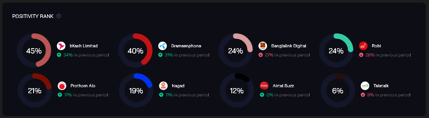
1. Positivity Rank
Description: The Positivity Rank chart measures the overall positivity of posts across selected sources. It provides an overview of sentiment trends over time.
Example Chart:
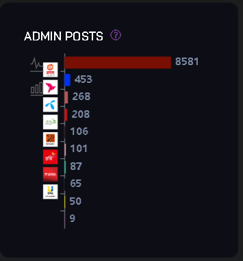
2. Admin Posts
Description: The Admin Posts chart displays the number of posts created by administrators of selected sources.
Example Chart:
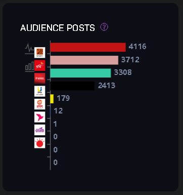
3. Audience Posts
Description: The Audience Posts chart shows the number of posts created by the audience or users of selected sources.
Example Chart:
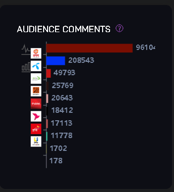
4. Audience Comments
Description: The Audience Comments chart visualizes the volume of comments made by the audience on posts from selected sources.
Example Chart:
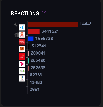
5. Reactions
Description: The Reactions chart tracks user reactions such as likes, shares, and emojis on posts across selected sources.
Example Chart:
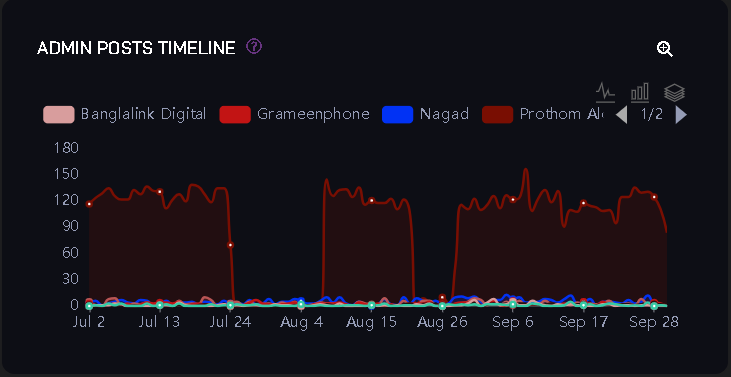
6. Admin Posts Timeline
Description: The Admin Posts Timeline provides a chronological view of posts created by administrators of selected sources.
Example Chart:
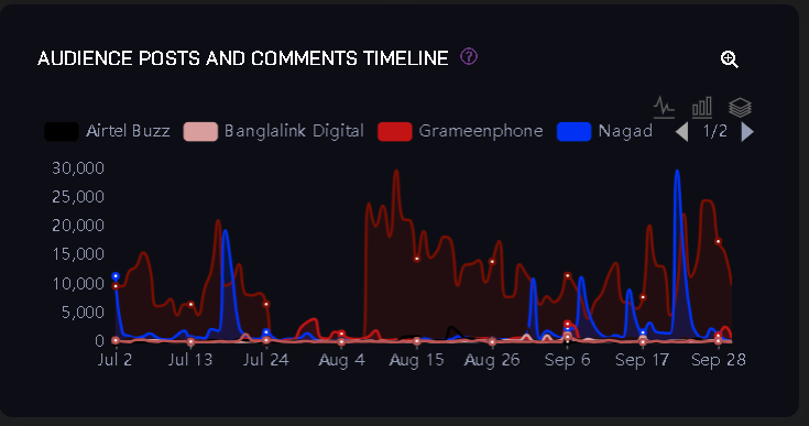
7. Audience Posts and Comments Timeline
Description: This chart combines the timelines of posts created by the audience and comments they make on posts from selected sources.
Example Chart:
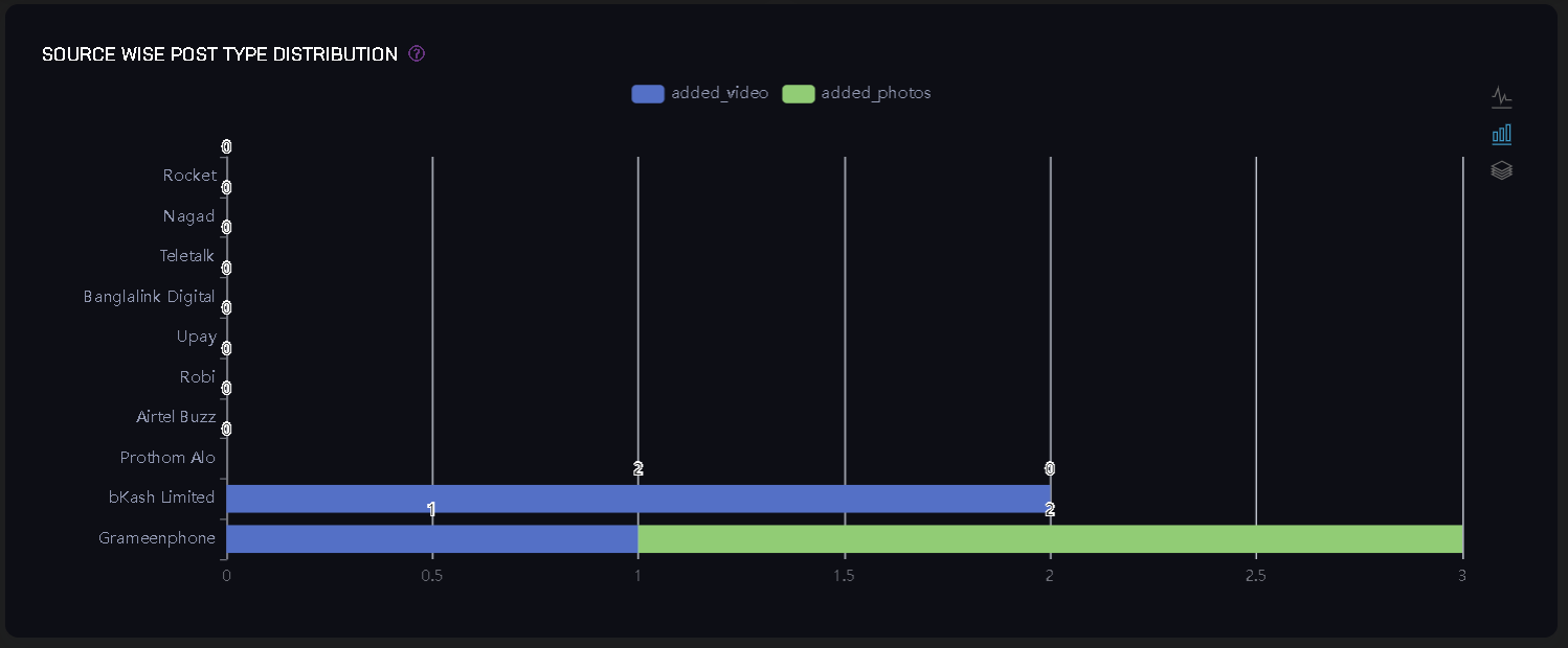
8. Source Wise Post Type Distribution
Description: The Source Wise Post Type Distribution chart categorizes posts by type (e.g., text, image, video) across selected sources.
Example Chart:
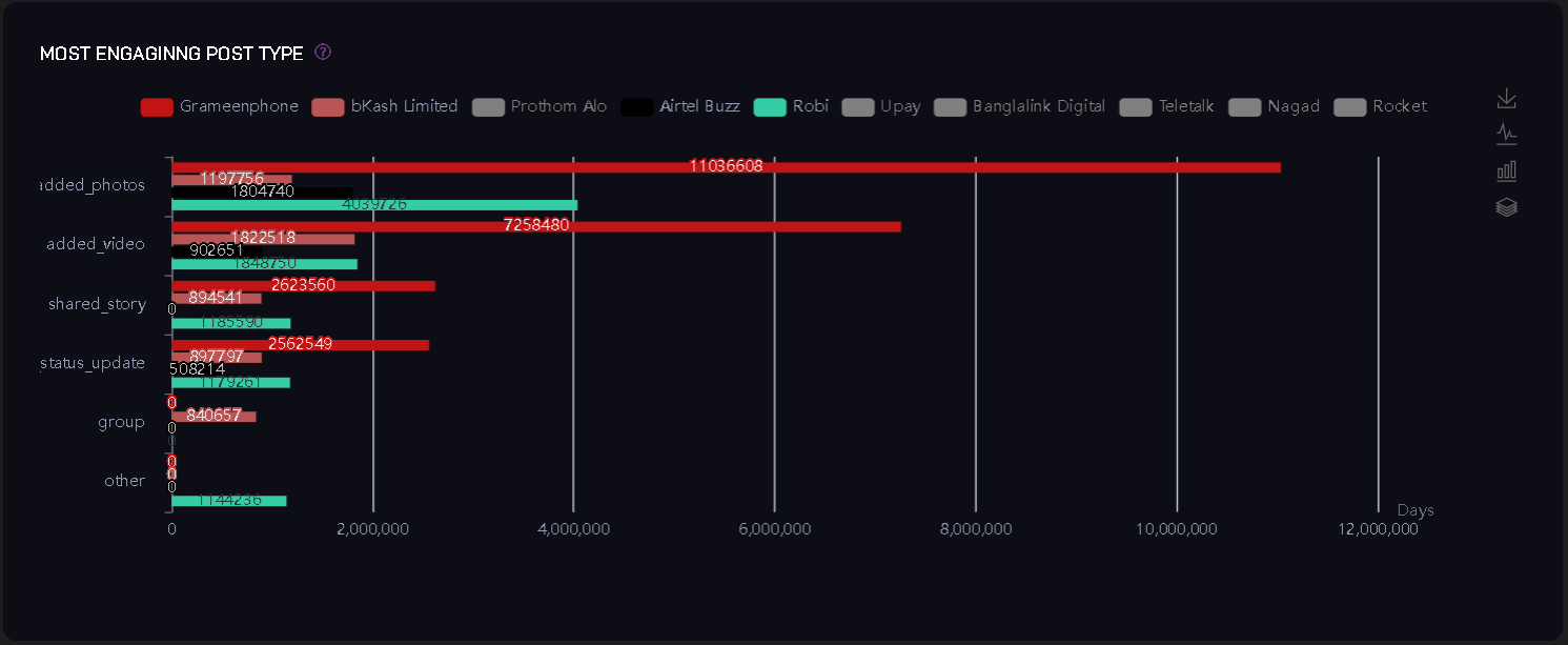
9. Most Engaging Post Type
Description: This chart identifies the most engaging post types (e.g., videos, images) across all selected sources.
Example Chart:
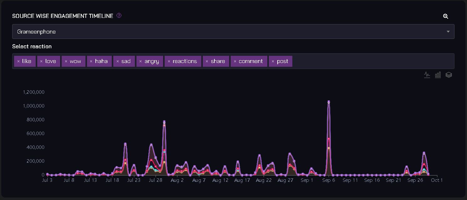
10. Source Wise Engagement Timeline
Description: The Source Wise Engagement Timeline displays the engagement levels of selected sources over time.
Example Chart:
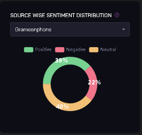
11. Source Wise Sentiment Distribution
Description: This chart visualizes the distribution of sentiment (positive, negative, neutral) across selected sources.
Example Chart:
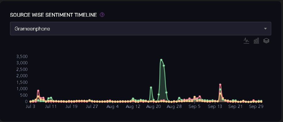
12. Source Wise Sentiment Timeline
Description: The Source Wise Sentiment Timeline tracks changes in sentiment over time for each selected source.
Example Chart:
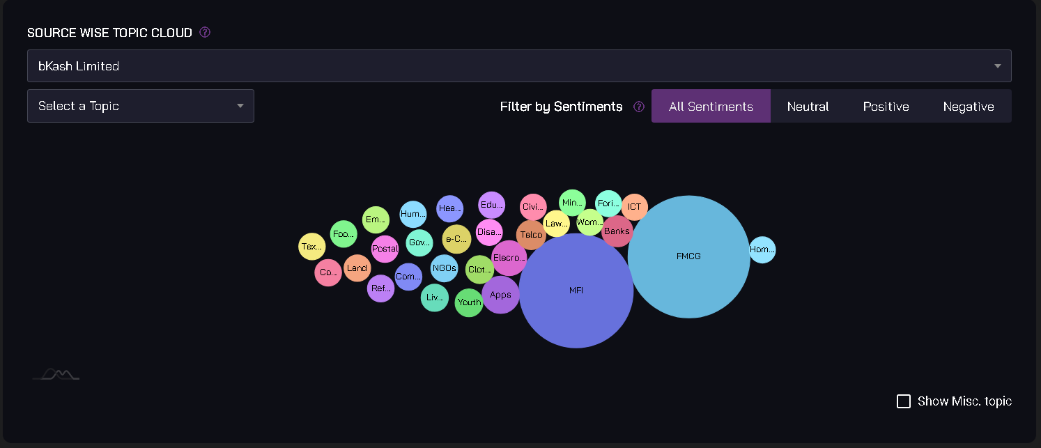
13. Source Wise Topic Cloud
Description: The Source Wise Topic Cloud displays the most prominent topics or keywords associated with each selected source.
Example Chart:
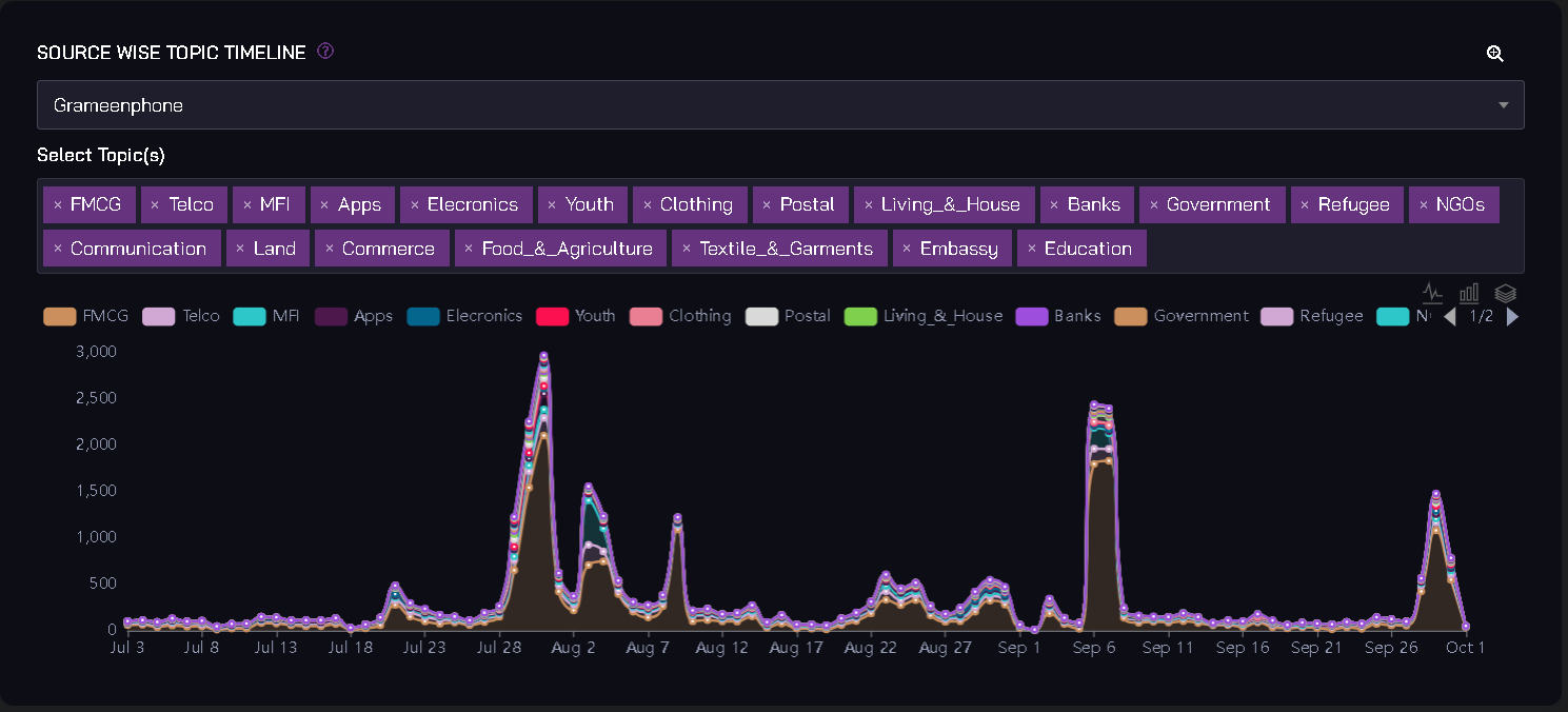
14. Source Wise Topic Timeline
Description: This chart provides a chronological view of how topic keywords associated with sources evolve over time.
Example Chart:
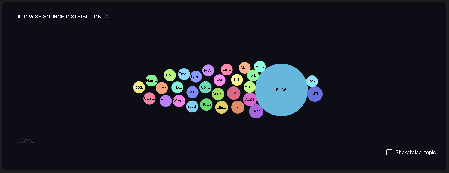
15. Topic Wise Source Distribution
Description: The Topic Wise Source Distribution chart shows which sources are most active in discussing specific topics.
Example Chart:
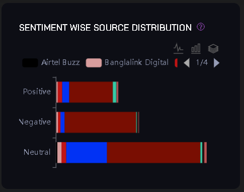
16. Sentiment Wise Source Distribution
Description: The Sentiment Wise Source Distribution chart highlights which sources are generating the most positive, negative, or neutral sentiments.
Example Chart:
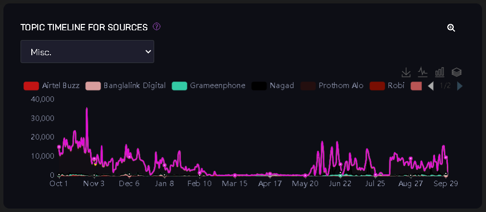
17. Topic Timeline for Sources
Description: The Topic Timeline for Sources chart presents a timeline of how topics evolve across different sources.
Example Chart:
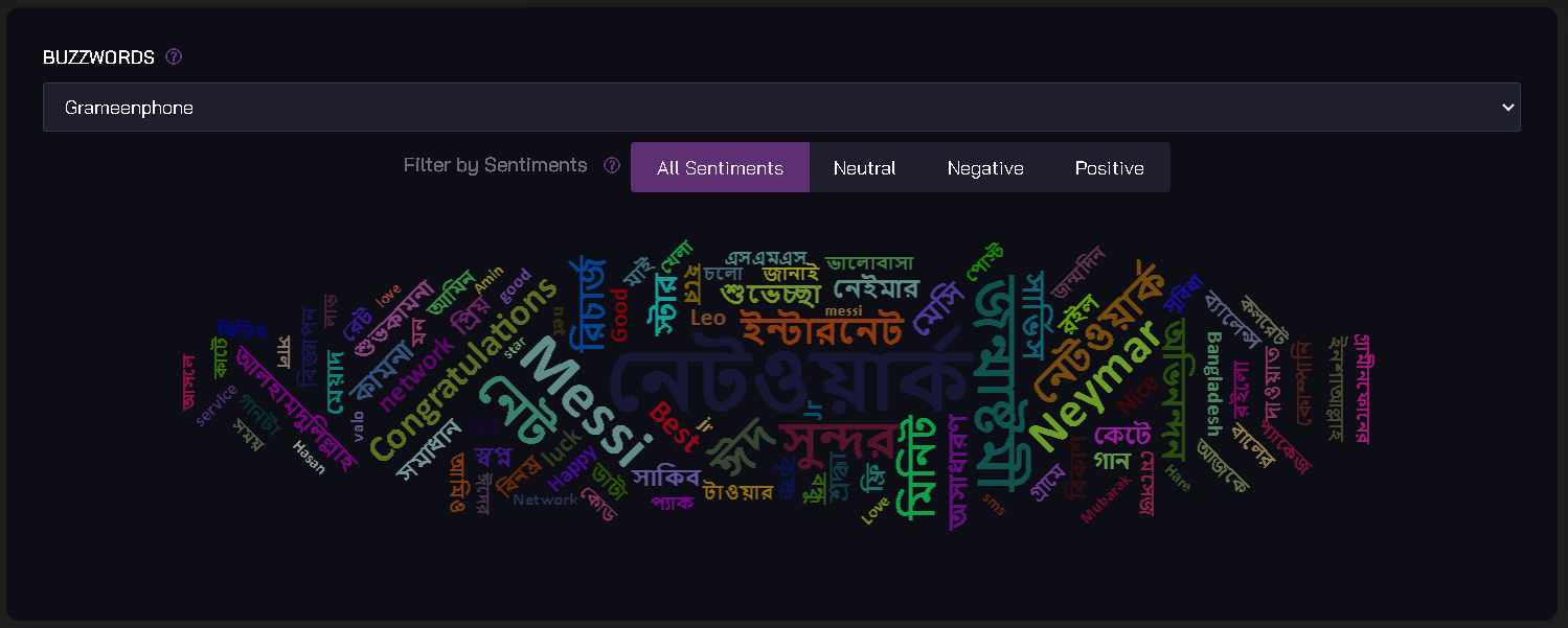
18. Buzzwords
Description: The Buzzwords chart identifies the most frequently mentioned keywords or buzzwords in posts from selected sources.
Example Chart:
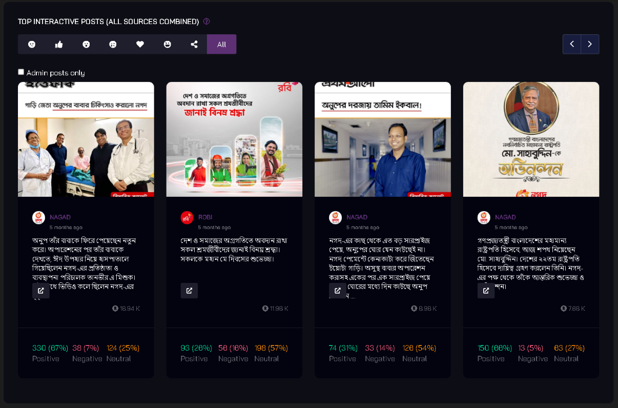
19. Top Interactive Posts (All Sources Combined)
Description: This chart lists the top-performing posts across all selected sources based on engagement metrics.
Example Chart:
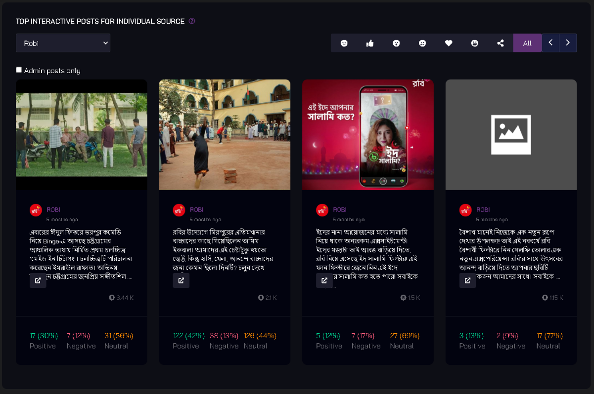
20. Top Interactive Posts for Individual Source
Description: Similar to the previous chart, this one lists the top-performing posts but for a specific source.
Example Chart:
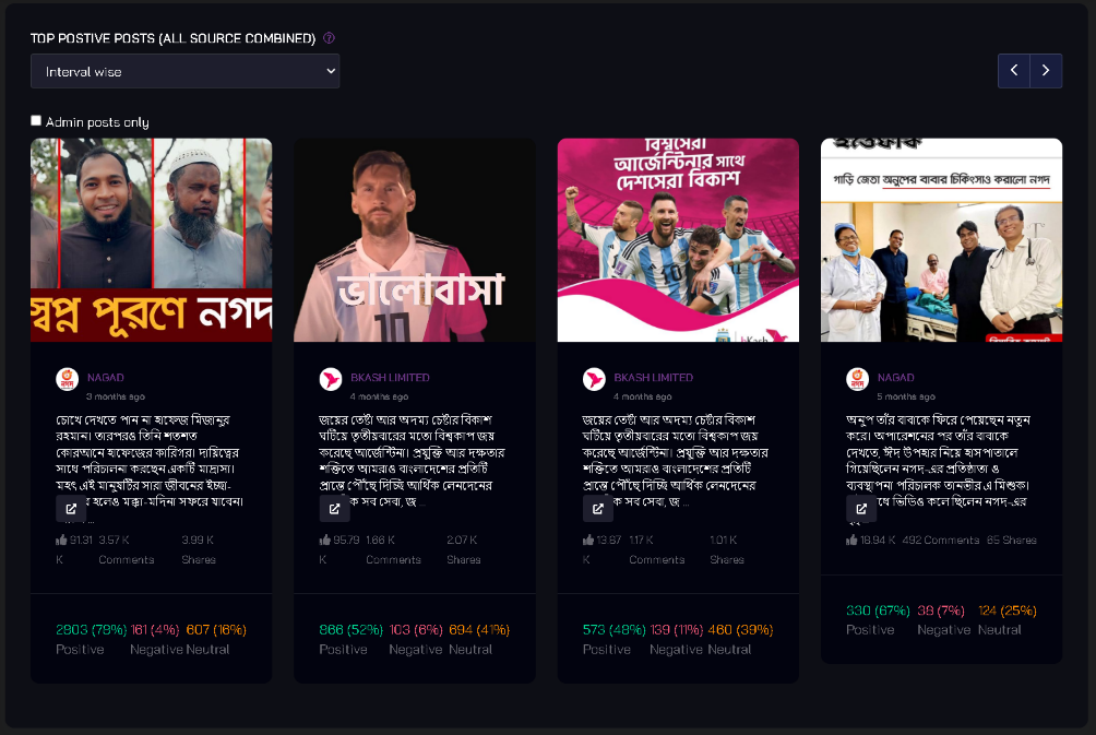
21. Top Positive Posts (All Sources Combined)
- Description: The Top Positive Posts chart showcases the most positively received posts across all sources.
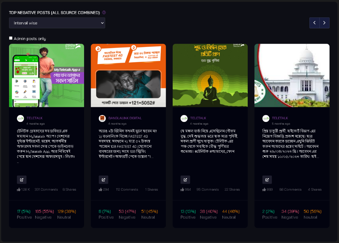
22. Top Negative Posts (All Sources Combined)
Description: Similarly, this chart highlights the most negatively received posts across all sources.
Example Chart:
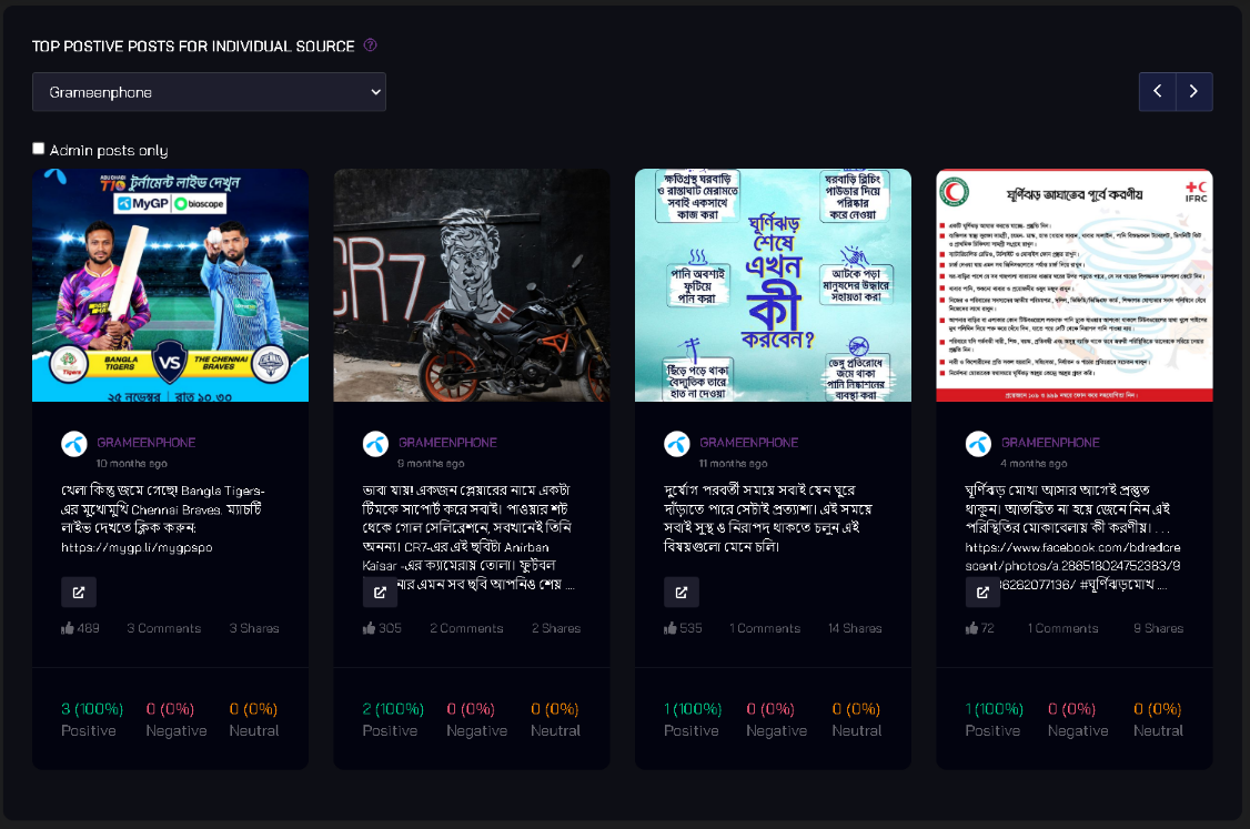
23. Top Positive Posts for Individual Source
Description: This chart identifies the most positively received posts for a specific source.
Example Chart:
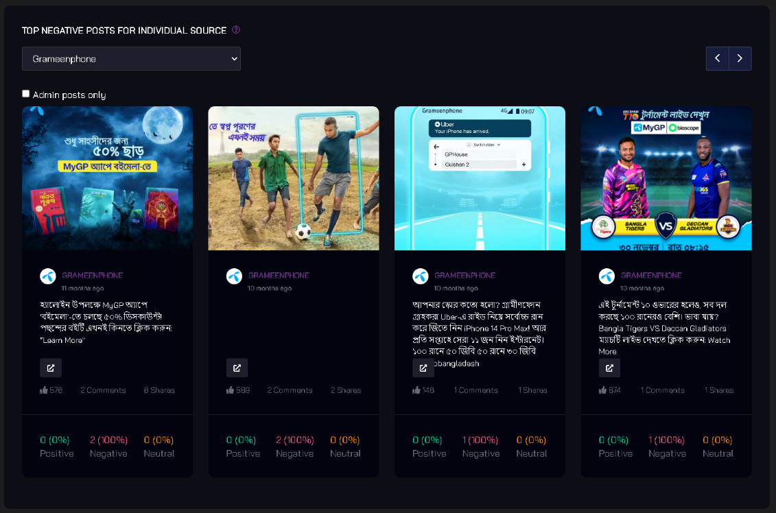
24. Top Negative Posts for Individual Source
Description: Likewise, this chart identifies the most negatively received posts for a specific source.
Example Chart:
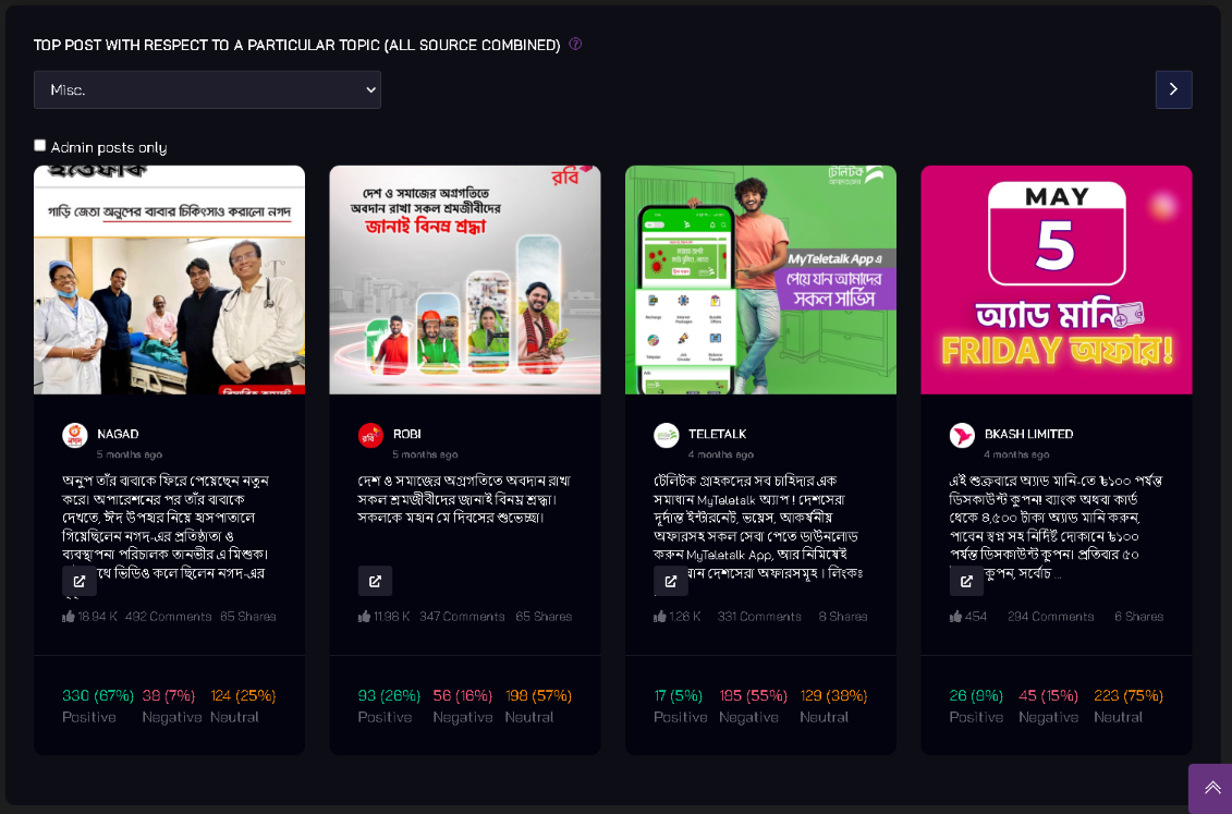
25. Top Post with Respect to a Particular Topic (All Sources Combined)
Description: This chart finds the top post related to a specific topic across all sources.
Example Chart: